Ogaanmarket
In collaboration with Quick Brown Fox and Turmeric Design
January 2020
Scope of Work
Naming, Brand Strategy, Identity Design, Brand Packaging,
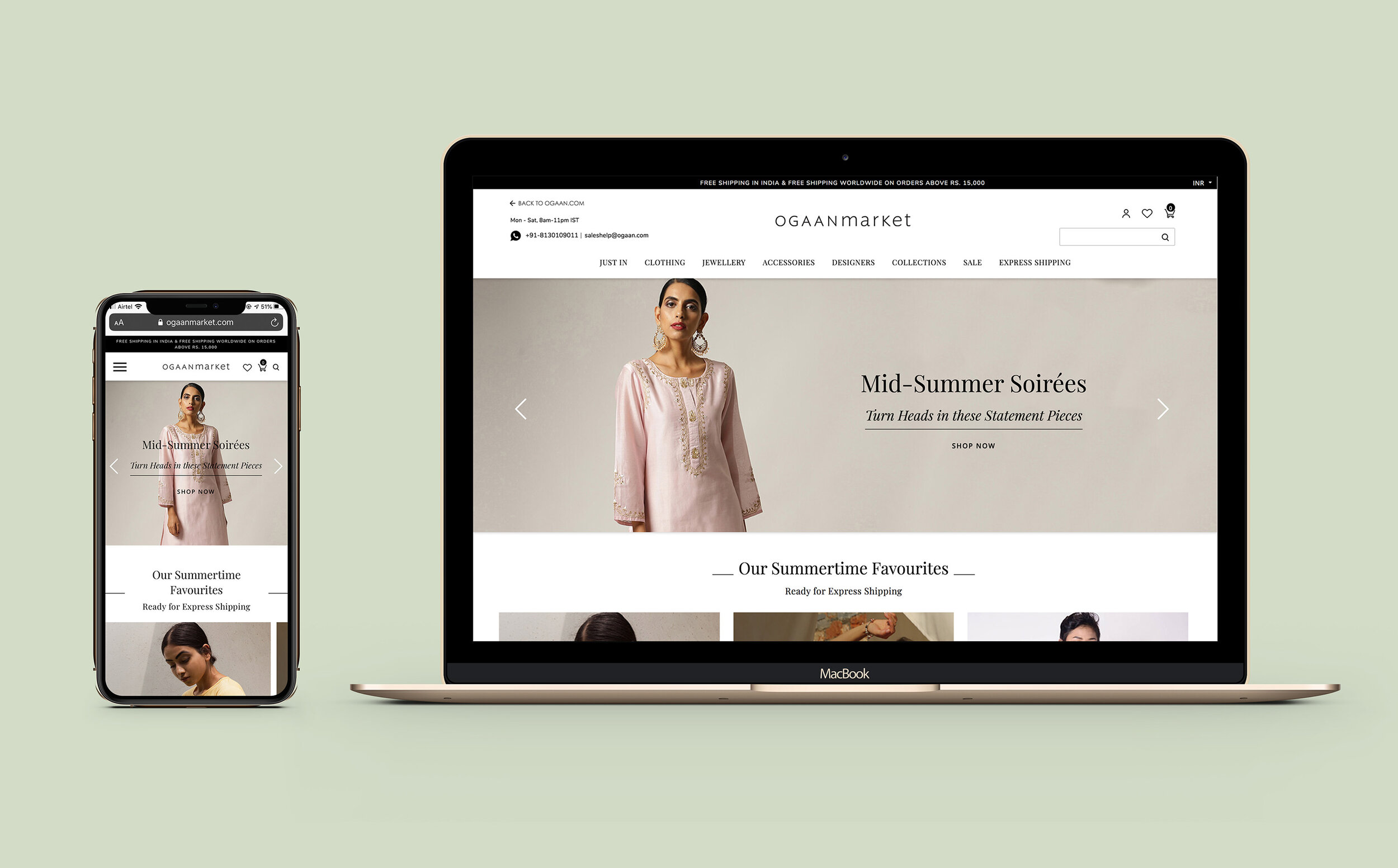
Website Visual Style
View Website
Overview
Ogaanmarket is an e-commerce platform housing collections from up and coming designers, curated by and under the Ogaan banner, focused on everyday luxury. Like it's parent brand, Ogaanmarket embodies timeless craftsmanship and high quality clothing, bringing it into a fresher and more accessible space. Our goal was to bring the brand alive, and to communicate authenticity with a touch of whimsy, playfulness and a sense of overall joy.
The Name and Identity
Ogaanmarket, typeset as a single word, combines the parent brand Ogaan, with 'market', a word that evokes an authentic, everyday experience- fresh, young, playful and fun. We used the word 'market' not so much in its literal sense, as in the feelings it evokes and the images it conjures— of colour, of eclectic prints and patterns, of whimsy, of freedom and of play.
We created a customised wordmark that combined Ogaan and Market into a single word. Set in Ideal Sans, a humanist sans-serif typeface, each letterform has distinct personality, and the combination of upper and lower-case letterforms reflects the spontaneous, free-spirited nature of the brand. While the logo and most text appears in black on our website, we selected a beautiful pistachio green as the brand colour- fresh, soothing and calm.

Brand Packaging
With sales primarily online, packaging was our most important brand touchpoint. It was the brand’s chance to connect with customers. With packaging, our goal was to make our customers feel special. Receiving a package from Ogaanmarket needed to feel like an occasion—from the quality of paper on the outer bag, to the beautifully printed tissue the garments come wrapped in, we paid careful attention to detail. All garments were wrapped and presented along with note cards, lifting the experience and making a package from Ogaanmarket feel more like a gift to oneself, than merely an online purchase.
Our garments were wrapped in paper that brought out the mood of our brand—easy, effortless and pleasurable, like a walk in the park. To bring this alive, we worked with the idea of an art print, combining illustrated flowers and leaves local to Delhi, as an homage to our parent brand and where it began.
We created the illustrations so they could be used as art print style wrapping paper or even as individual elements on brand packaging, stationery or communication