


Healthland
Commissioned by Bombinate Technologies
January 2024
Launched - 13 May 2024
Scope of Work
Brand Name and Tagline, Brand Identity Design and Visual Design
Overview
In January 2024, I was approached to help build a brand for a holistic clinic for children. The clinic aimed to provide complete care for children ages 0-18 under one roof, to promote preventative care and wellness and redefine the experience around paediatric care.
Brand Strategy, Naming and Tagline
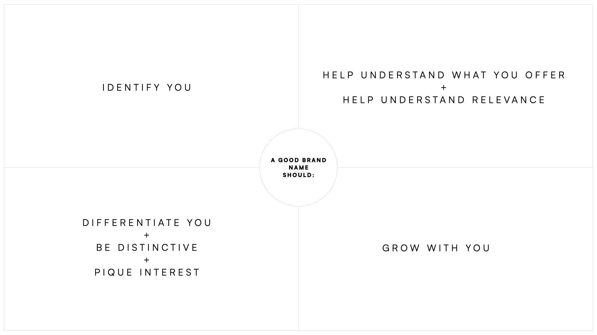
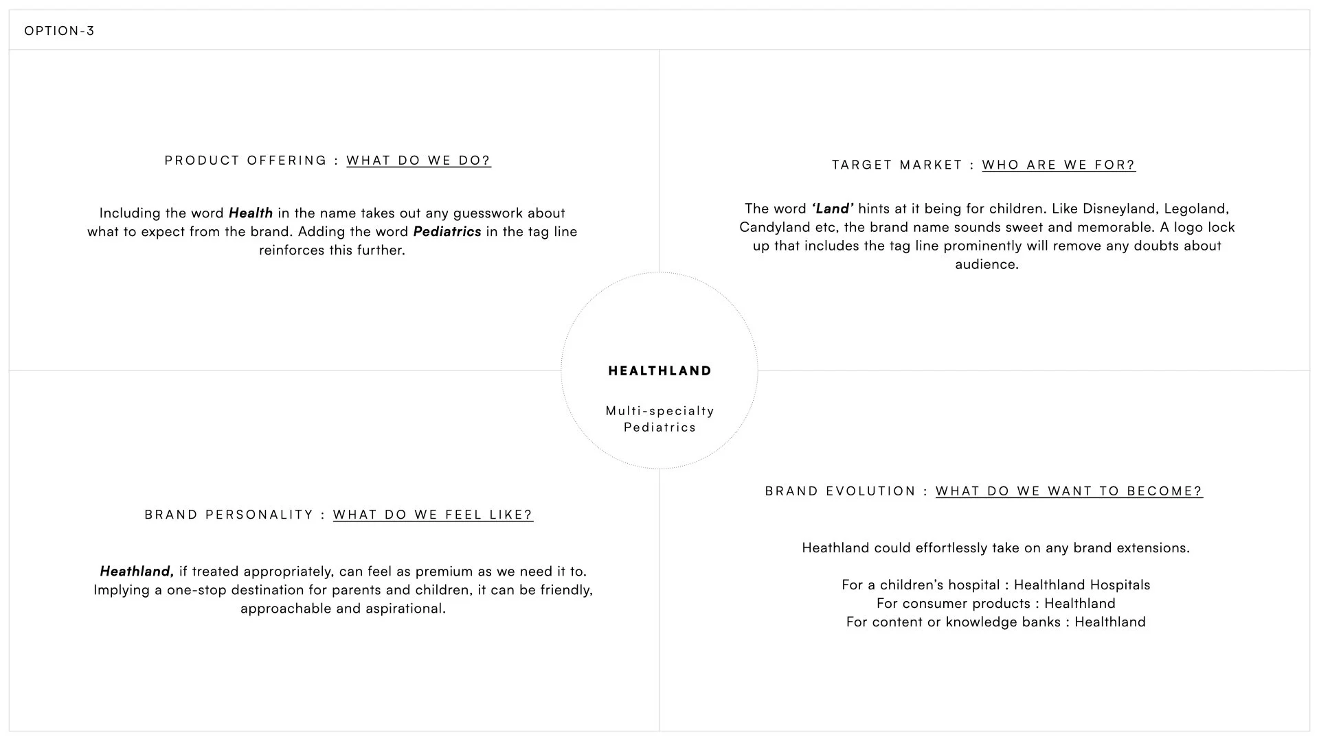
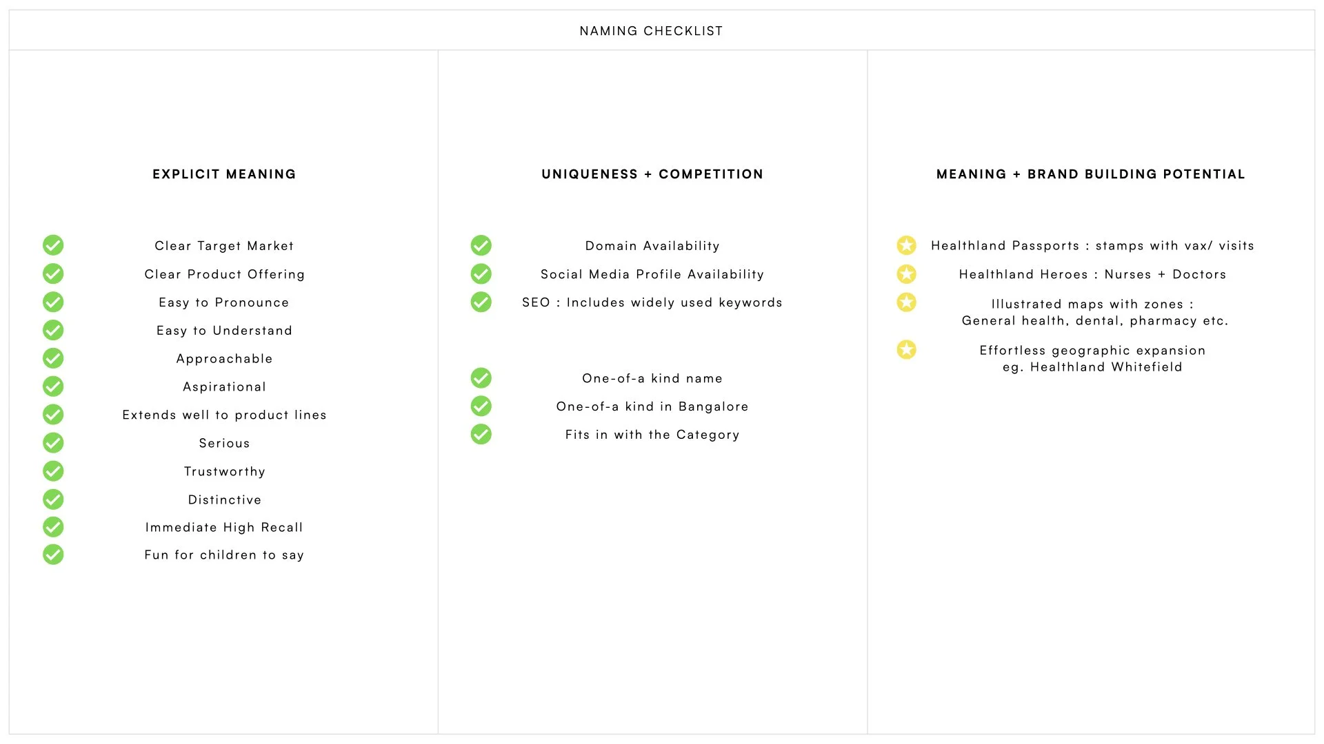
When it comes to clinics in Bangalore city, the market is saturated with hundreds of clinic, each with similar sounding names. The challenge here, was to identify a name that would stand out, that would be memorable and that could grow and evolve with the brand. Our strategy lead us to Healthland, a name that described a world of Health— a place you went to to be taken care of.

Design
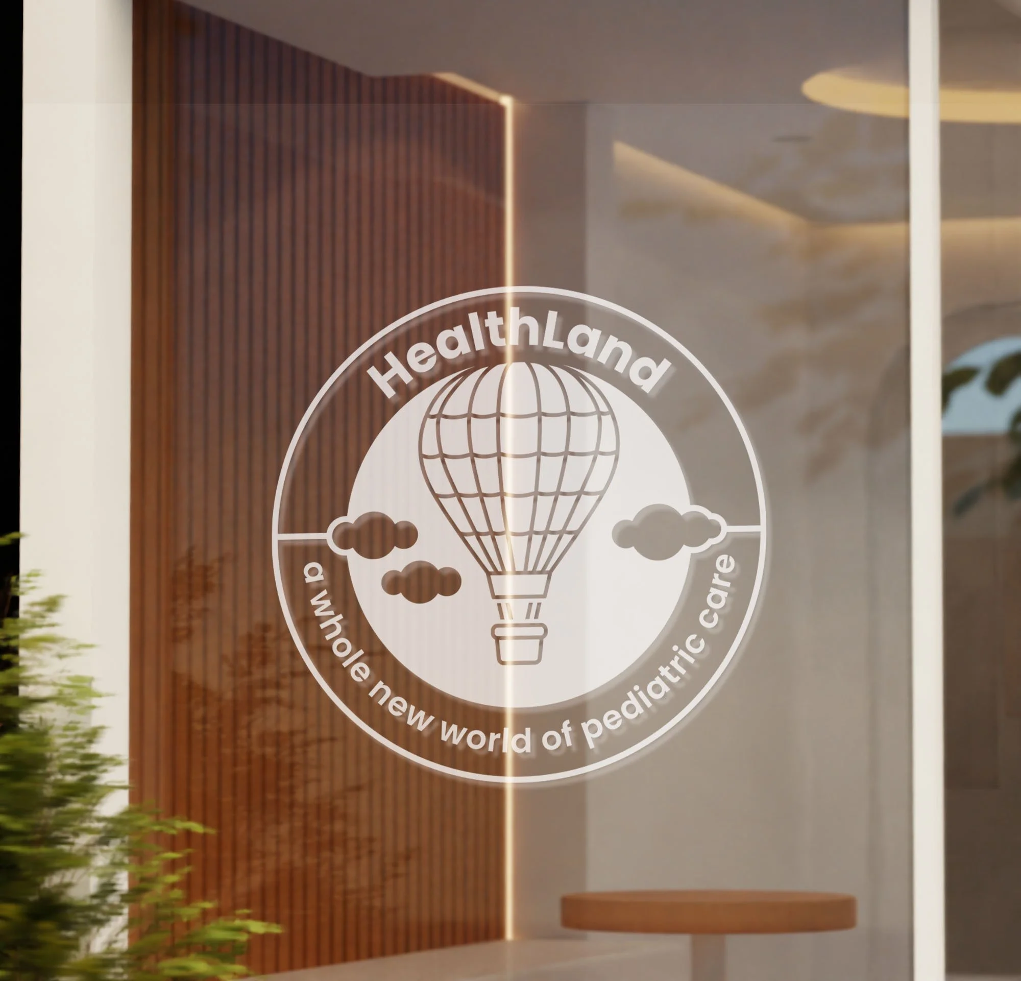
The logo we chose to work with is a single, cohesive unit in the form of a badge, that includes the Healthland wordmark, a tagline and an illustrated hot air balloon symbol. Soaring in the air, and making it’s descent into Healthland, our logo, a balloon in the sky, signifies a new perspective on health and wellness— a bird’s eye, 360 degree view of this never-seen-before land below. Hot Air balloons, with their vibrant colours capture the imagination of adults and children alike, and do not fail to inspire wonder. The circular form acts as a badge, a mark of authenticity and authority. The hot air balloon, with a medical cross symbol subtlety worked into the folds signifies a new perspective on health. The vibrant colours are uplifting— the perfect metaphor for physical and mental well being.
One of the big decisions we had to make, was choosing whether or not to include a cross as a symbol of healthcare. In India, when it comes to medicine and the cross, the symbolism is established and has grown to be an easy mark of recognition for medical institutions. This approach to design, works the cross into the identity in a subtle way, and was one of the reasons it was selected.


One of the biggest differentiators at Healthland, was their service, and the overall experience for children. Instead of an intimidating looking file , patients were given a welcome kit at registration with a folder, a Healthland Passport and a badge of belonging.

The Healthland Passport stamped with each visit and milestone, giving children something exciting to look forward to.

Easy to read, image based dosage instruction cards for medication


Given its location off a busy main road, signage was a very important part of the branding;Our logo had to work across multiple formats from eve signs to flags to ensure that it drew the attention of passing vehicular and pedestrian traffic.
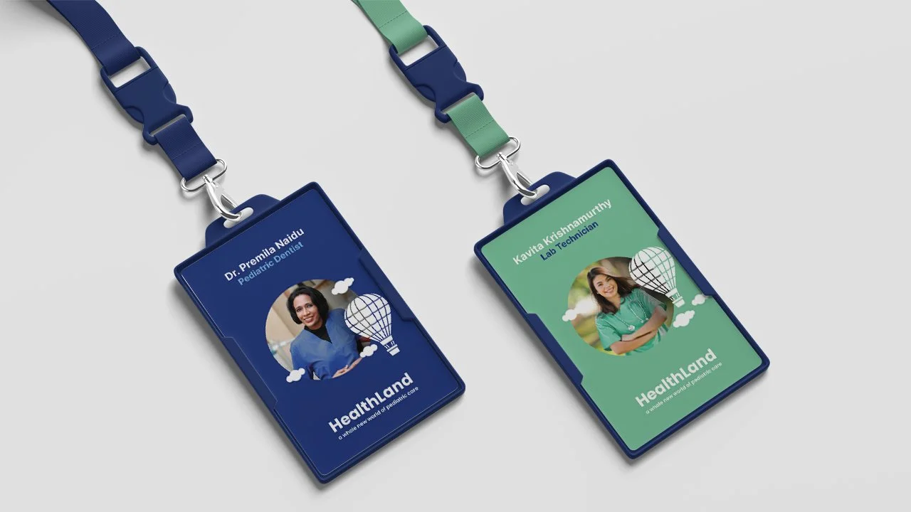
While vibrant and cheerful, the Healthland colour palette was also used with intention across applications. Doctors wore blue scrubs and had blue identity cards, nurses and medical staff wore green scrubs and identity cards while support staff wore yellow.


Ultimately, the goal was to give both parents and children an environment that was welcoming and an experience that was reassuring in what might otherwise be anxiety inducing, distressing circumstances.
Impact
Healthland has opened to an overwhelmingly positive response. Here are some of the Google Reviews from the opening week.
“Healthland Clinic on Nallurhalli Road is a new and well-designed medical facility that primarily focuses on pediatrics. Despite its recent establishment, the clinic stands out for its excellent services and welcoming environment.”
“This is a very beautiful place for kids doesn't feel like clinic or hospital. Staffs and Doctors are awesome as usual. Very supportive and friendly environment they have provided in Bangalore”
“Unique clinic set up, very child friendly.. Children don't feel like leaving the clinic and go home.”